Visualising numbers for (almost) each country in the world is quite common. But because these visualisations typically contain between 150 and 200 data points, labelling each point is a challenge. More often than not, identification of each country depends on the viewer interacting with the visualisation: data points can only be identified by clicking them or hovering over them.
But this is a slow process: the viewer can only identify one country at a time. And on top of that, viewers might not understand that the chart is interactive and not use this interactive feature at all. And of course, with printed charts, there is no interactivity at all.
In the bubble plot death rate and birth rate data for 186 countries are plotted. The country bubbles are scaled to the population of each country. To identify a country and get access to the underlying data, you can hover each bubble.
Source: forked from Scatterplot of Text Labels, by Richard Brath
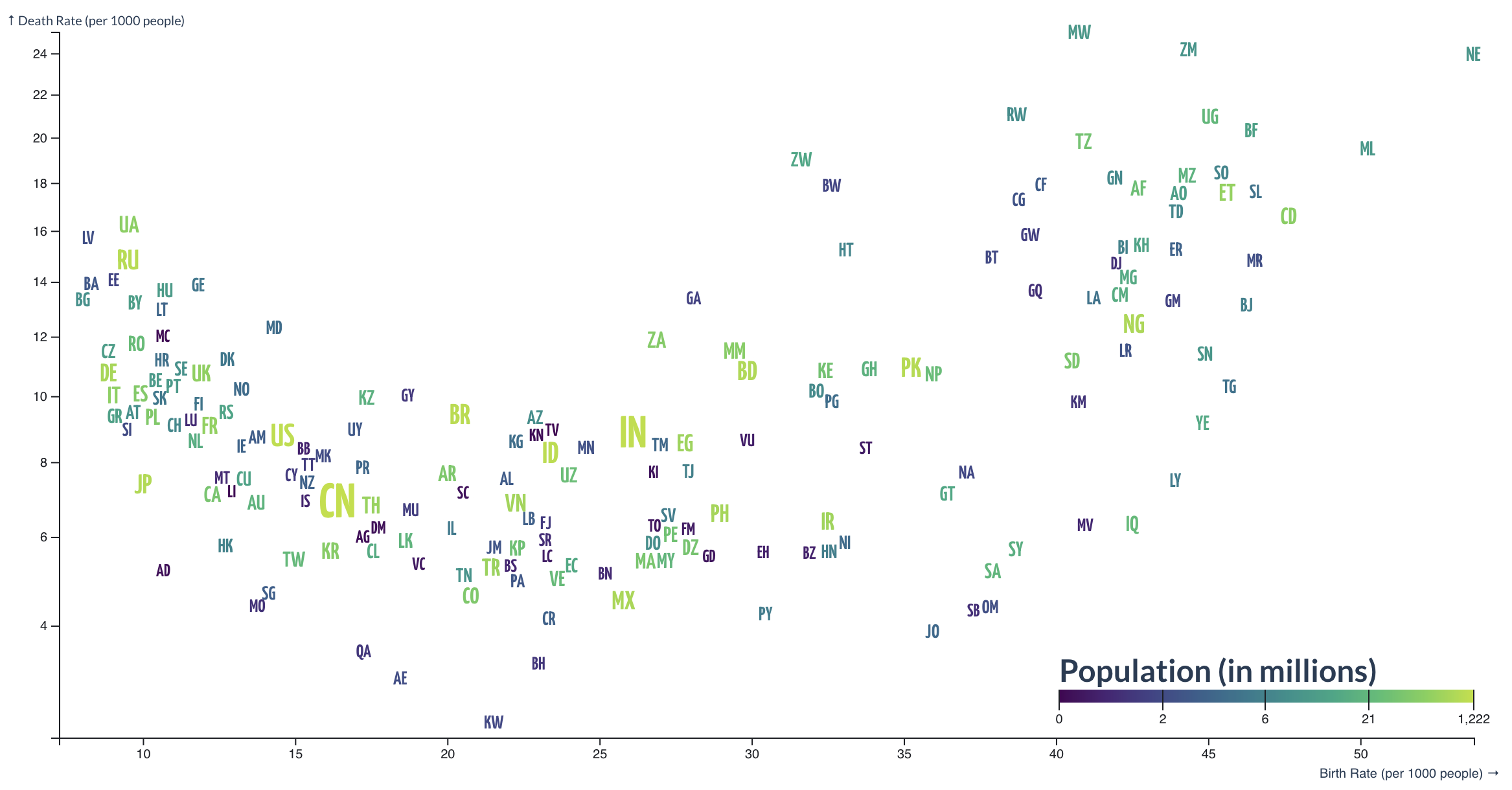
Instead of using circles, 2 or 3 letter country codes can be used to visualise the same data.
Source: forked from Scatterplot of Text Labels, by Richard Brath
This time, the chart is a static image, and if you are somewhat familiar with (English) country names and country codes, you should be able to identify most countries. When the chart would be interactive, the same hover functionality could be added to let the viewer get access to the full country names and the data as the bubble chart above has.
Note that the font sizes of the country codes are scaled according to country population, just as is done for the bubble sizes in the bubble chart. The placement of the country codes is also optimised to prevent overlap between labels, so the position of the labels is not 100 percent accurate (especially not in areas of the plot where a lot of countries are clustered together).