Very similar to stem-and-leaf plots, words (and other texts) can be stacked to create bar charts or histograms of words. These contain much more information than the same chart without the text would be able to contain.
Take for example the plot below. It arranges the 2 letter codes for US states to create a stem-and-leaf plot of the poverty rates in each state (the meaning of the colours and font weights is discussed later in this module).
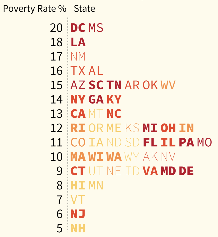
Source: Visualizing with Text, by Richard Brath
The example below is a horizontal version of this chart that shows that this technique can scale up to a lot of data points, even with full company names in this case.
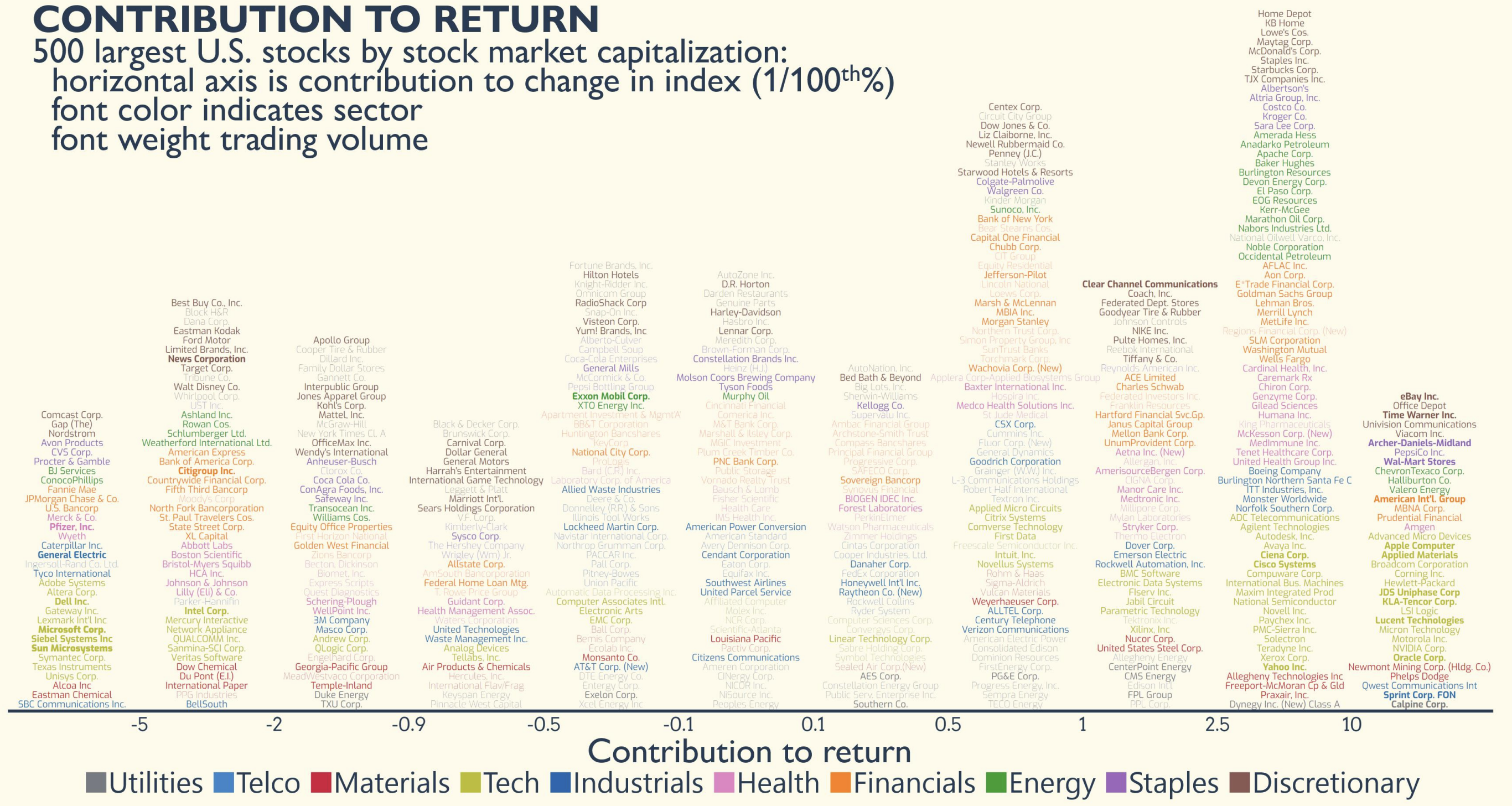
In this plot, the names of the 500 companies in the Standard & Poor’s index are arranged according to their negative or positive contribution to the index (this is the horizontal axis). The names of the companies are stacked and coloured and grouped within each stack according to their sector. Finally, the companies with a big trading volume are in bold, while the companies with a small trading volume are printed using a light font weight. Source: Visualizing with Text, by Richard Brath
A similar technique was used by Bloomberg News at the occasion of the 2022 Winter Olympics in Beijing. It plots the cumulative number of countries that won a medal in the Winter Olympics over time by stacking 3 letter country codes on top of each other. Countries that won a medal in a specific year are printed in bold, countries that won a medal for the first time in a specific year are highlighted in colour.
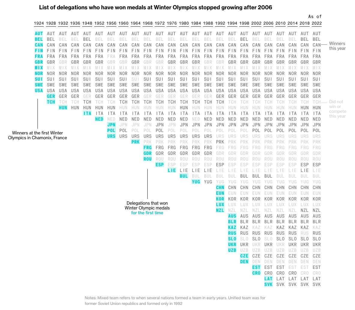
Source: Jane Pong for Bloomberg News
Related is the front page the New York Times ran on May 24 2020, at the moment the US registered 100.000 Covid-19 deaths. The news paper printed the names and small obituaries of 1.000 of these people and printed/stacked them next to and on top of each other to communicate the magnitude of this number, instead of plotting the number of deaths with an abstract line chart.
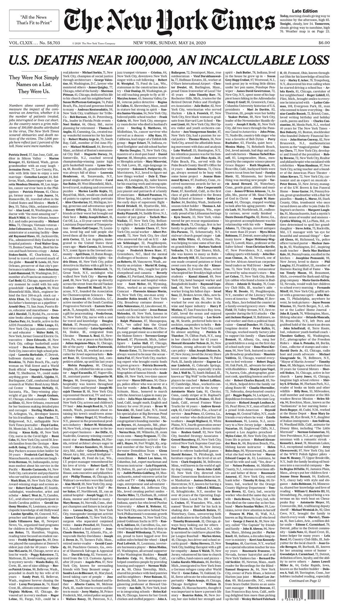
Source: 100,000: The Names Behind a Grim Toll, nytimes.com