When multiple time series can be summed together to a total, they can be visually stacked on top of each other to show both the total and its components.
The stacking can be done in multiple ways, as the examples below show. But a disadvantage of these stacked charts is that the shape of each individual time series is determined by the underlying time series. So one stacking method can paint a very different picture than the other. This is the reason these charts are not very well suited to spot trends in individual time series, or to make comparisons between time series. They should mainly be used when the totals are more important to show than its components.
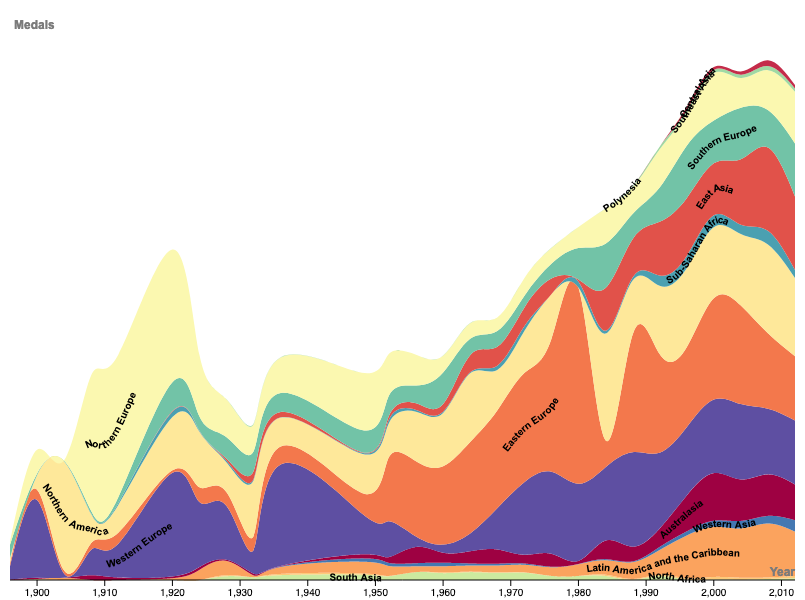
The classical way of stacking time series is the stacked area chart. The following chart shows the number of medals won by countries from different regions in the world.

A stacked area chart showing the number of Olympic medals won by countries grouped in regions. Source: chart made with RAWgraphs, Maarten Lambrechts, CC BY SA 4.0
Just like with line charts, an interpolation method that produces curves instead of a linear interpolation gives a more aesthetically pleasing result (see Line interpolations).
Source: chart made with RAWgraphs, Maarten Lambrechts, CC BY SA 4.0
The ordering in which the series are stacked on top of each other also determines how stacked charts look. In the following version of the chart, the series with the highest values are at the bottom of the stack.
Source: chart made with RAWgraphs, Maarten Lambrechts, CC BY SA 4.0
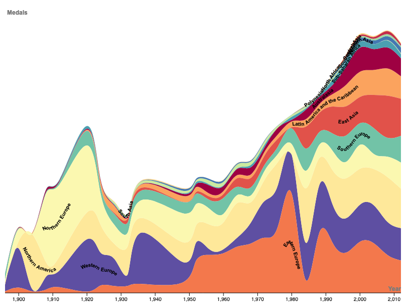
The shape of the series can be adapted in a way that the series with the highest value is on top of the others for all moments in time. This chart type is called a bump chart.
Source: chart made with RAWgraphs, Maarten Lambrechts, CC BY SA 4.0
Stacked charts can also be used to show relative numbers (percentages) instead of absolute numbers.
Source: chart made with RAWgraphs, Maarten Lambrechts, CC BY SA 4.0
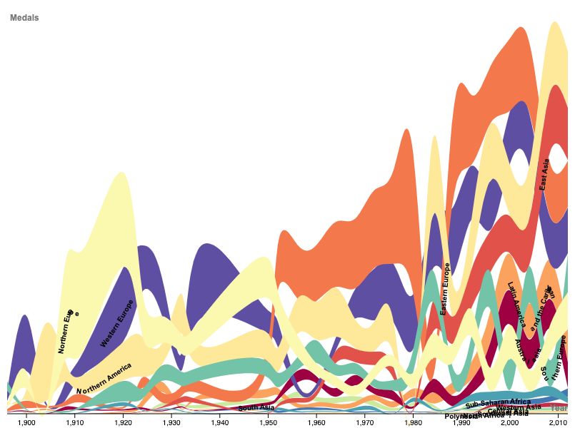
A different chart type results from not stacking the time series from the bottom of the chart, but instead organise the series around a central axis. This chart type is called a stream graph, and has a more flowing and organic shape than classical stacked area charts.
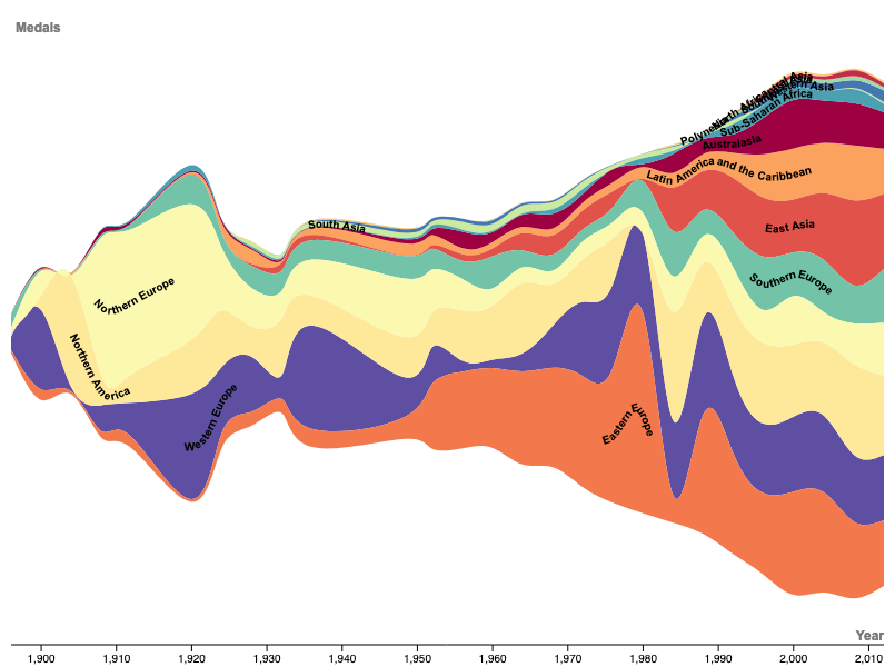
Source: chart made with RAWgraphs, Maarten Lambrechts, CC BY SA 4.0
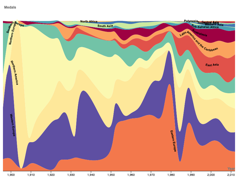
Finally, because the series in a stream graph are stacked around a central axis, it makes sense to order the series from the inside to the outside, with the series with the highest values in the center and the smaller series on the edges.
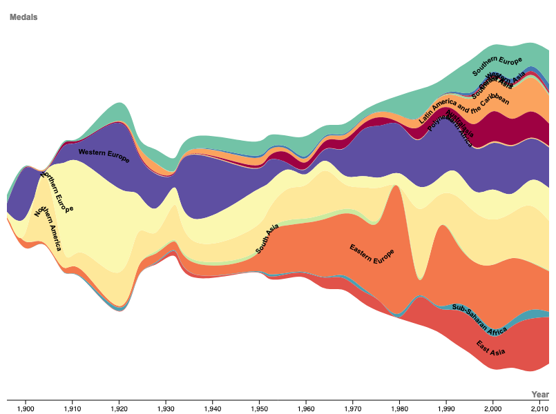
Source: chart made with RAWgraphs, Maarten Lambrechts, CC BY SA 4.0