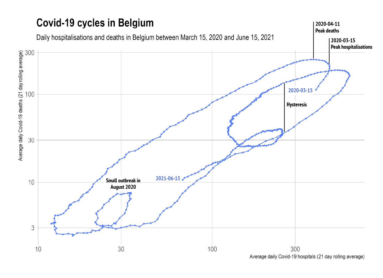
When you want to see the relationship between 2 time series over the same period, you can just plot the time series next to each other. But a more powerful way of revealing this relationship is by using a connected scatter plot.
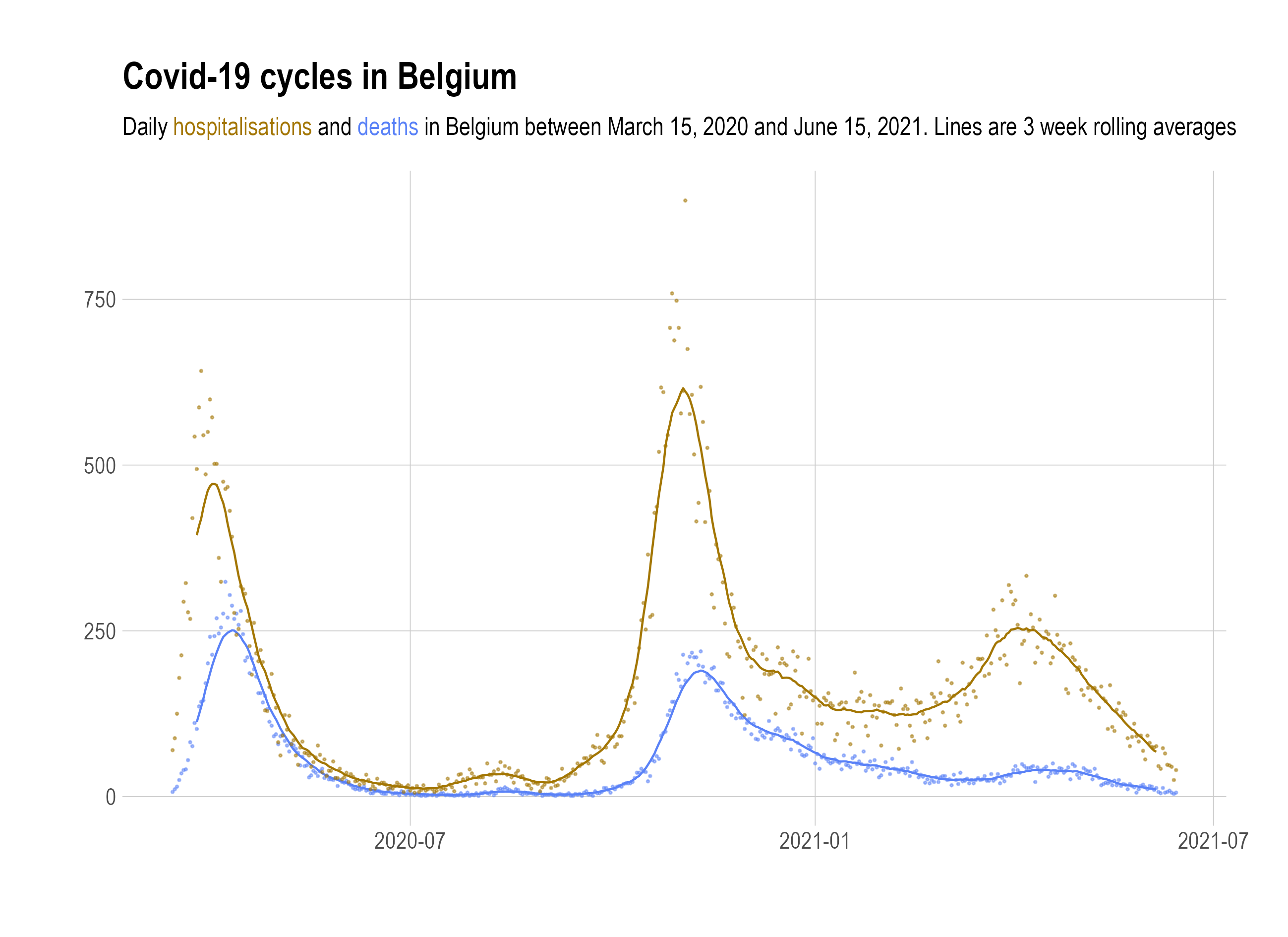
The chart below shows the weekly averages of Covid-19 hospitalisations and deaths for Belgium in 2020.
Source: Maarten Lambrechts, CC BY SA 4.0
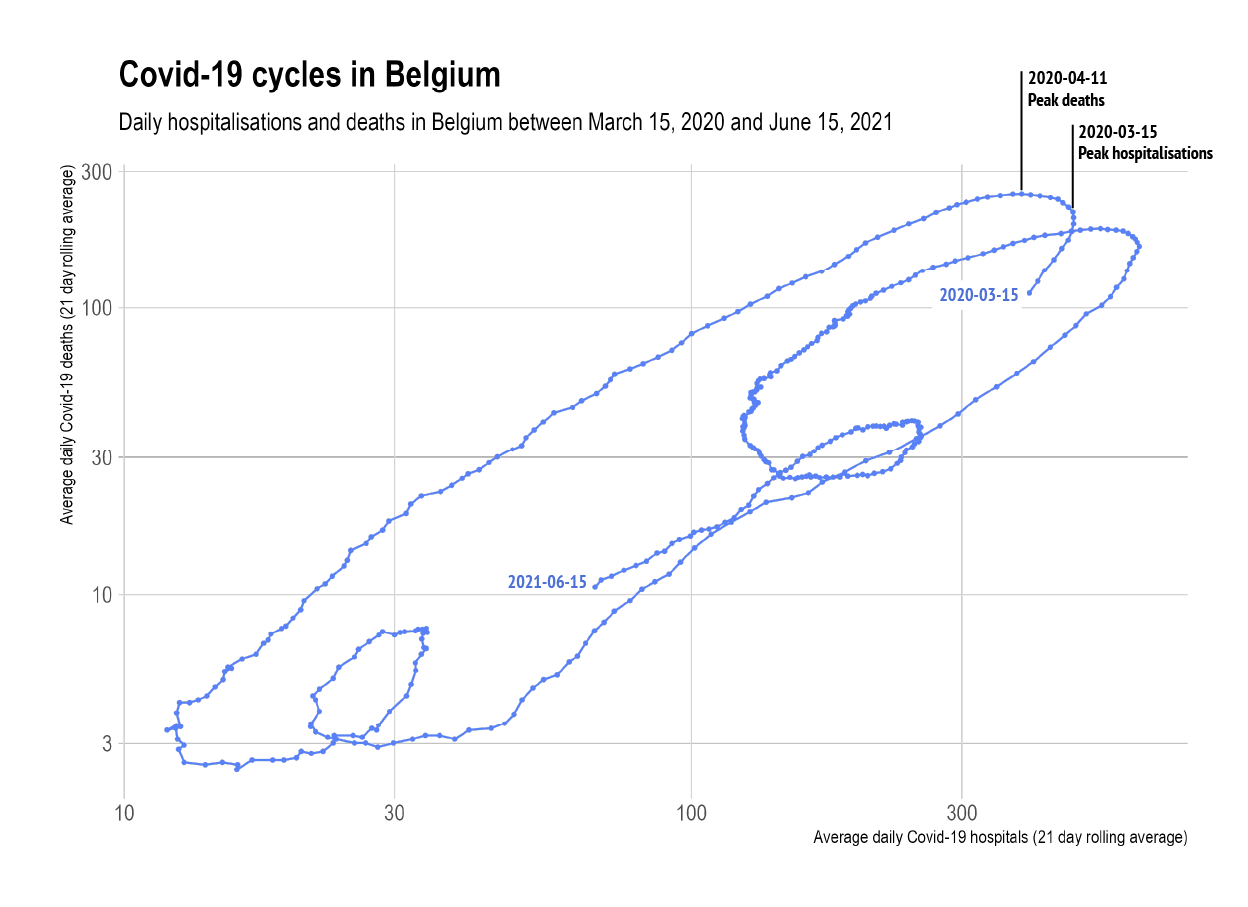
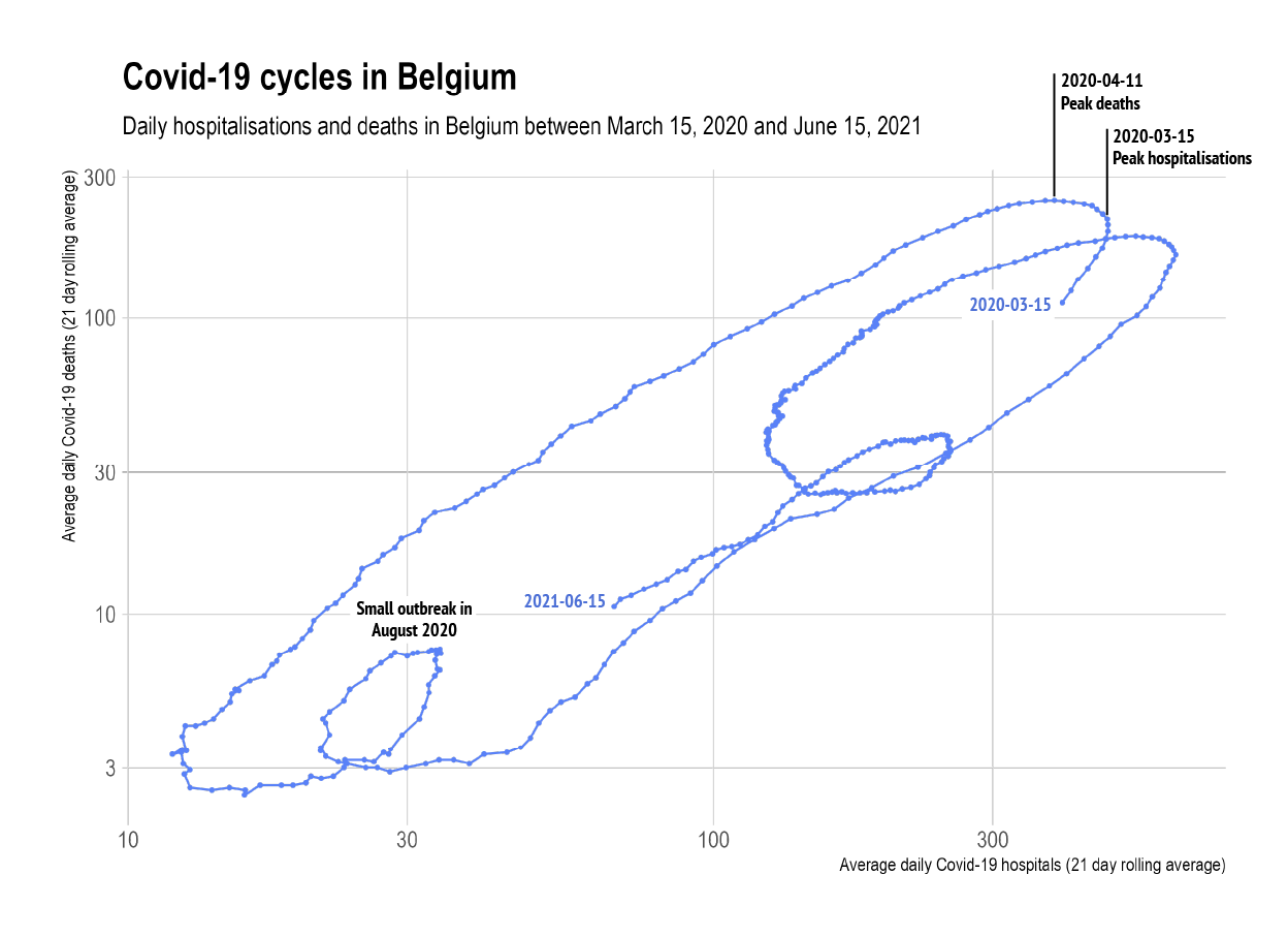
In order to make a connected scatter plot, you can plot the hospitalisations on the x axis and the number of deaths on the y axis. Then the points in the scatter plot are connected chronologically.
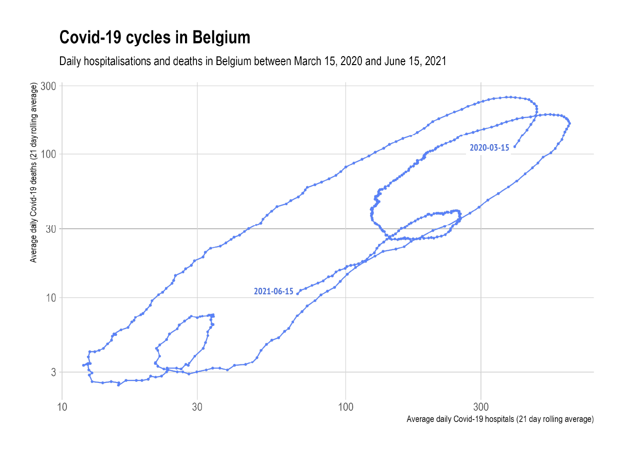
Note that this chart uses logarithmic scales for both x and y. Source: Maarten Lambrechts, CC BY SA 4.0
From this chart, some elements become much more obvious than they were on the initial line charts. For example somewhere end March-beginning of April the number of hospitalisations peaks (the curve starts moving to the left). A little later, the number of deaths peak (the curve moves down again).
Source: Maarten Lambrechts, CC BY SA 4.0
In connected scatter plots, a loop in the curve means that there is a delayed correlation: a change in one variable is followed by a change in the second variable, but with a delay. In August there was also a little flare up of the virus, which was quickly controlled. This is visible on the curve as a small loop in the bottom left.
Source: Maarten Lambrechts, CC BY SA 4.0
There is also a difference going up to the peak versus going down: at the same number of hospitalisations, the number of deaths is much higher descending from the peak of hospitalisations than moving up to the peak, an effect called hysteresis.
Source: Maarten Lambrechts, CC BY SA 4.0
So connected scatter plots may be a good solution for showing the correlation between 2 time series. But they don’t work for all data: connected scatter plots can become quite busy, and when the correlation is not very strong, other ways of visualising your data might be better.
Most people are not familiar with connected scatter plots. So when you do use them, make sure to explain very well to your reader how the chart should be read. This can be done by making good use of labels and annotations.
A classic connected scatter plot is the example below, showing how the distance driven per capita and the traffic accident fatalities in the United States have evolved over time. The way to read the chart is explained with
- axes titles in bold, with arrows pointing at the higher end of the axes
- duplicated axes titles left and right
- integrated smaller versions of the chart in the chart annotations, highlighting the period the annotation is referring to
- labels for each year
- repeated arrows showing the chronological order of the data points
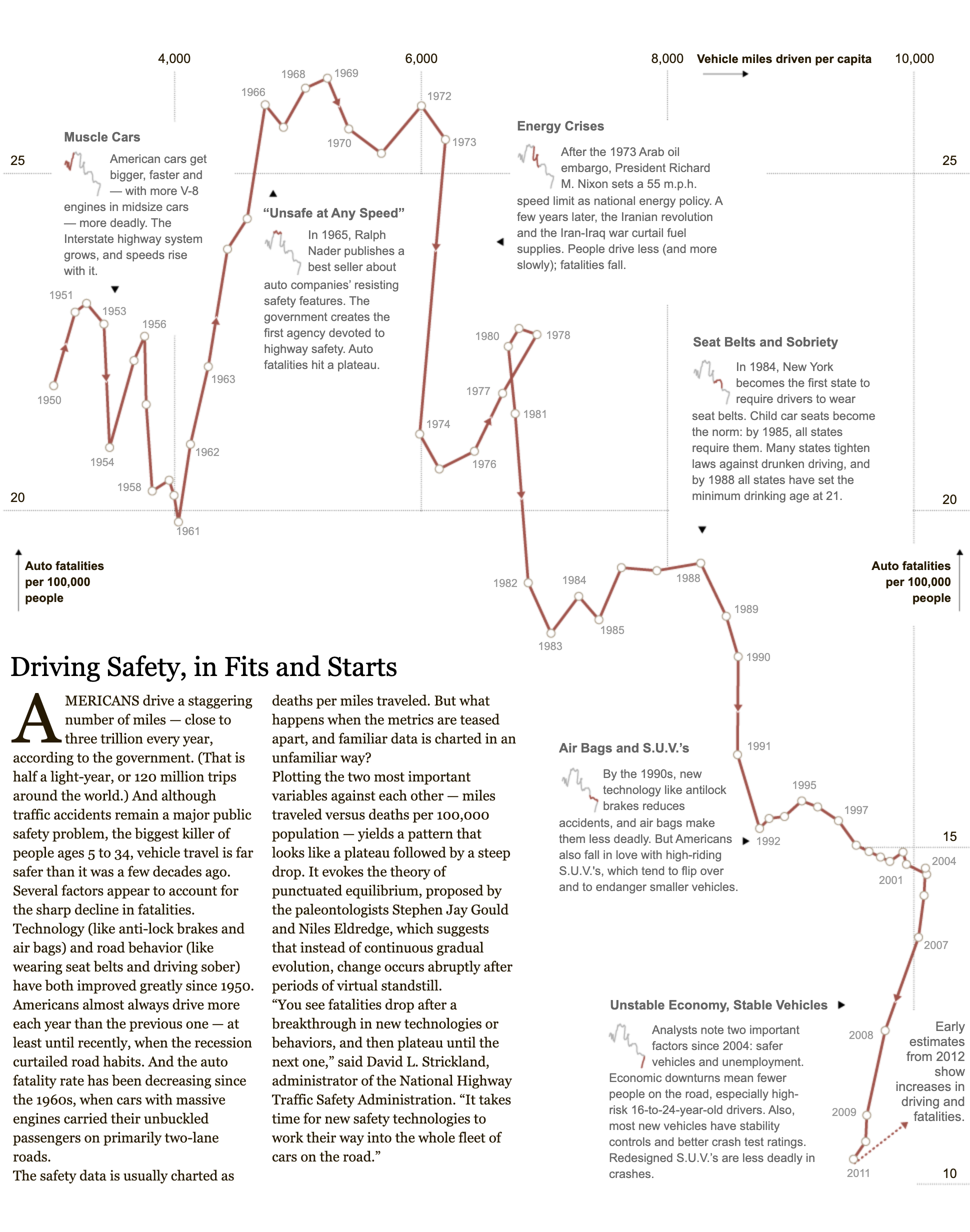
Source: Driving Safety, in Fits and Starts, nytimes.com