When time series data consist of daily measurements, or when the data can be aggregated into daily values, a calendar heatmap can pack a full year of daily measurements into a single, compact visualisation. When the time series data spans multiple years, multiple heatmaps can be created and placed below each other.
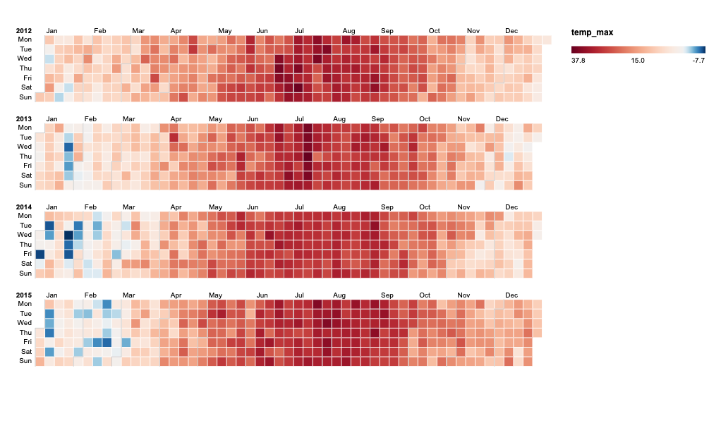
A calendar heatmap of daily maximum temperatures in New York over 4 years. It is easy to spot that freezing days occur mostly January and February, with a very cold 3 day spell in January 2014. July 2013 had a very warm week. Chart made with RAWGraphs, source: Maarten Lambrechts, CC BY SA 4.0
Calendar heatmaps can be enriched with bars to show aggregates for weeks and days of the week. This can be really helpful to spot cyclic patterns in the time series.
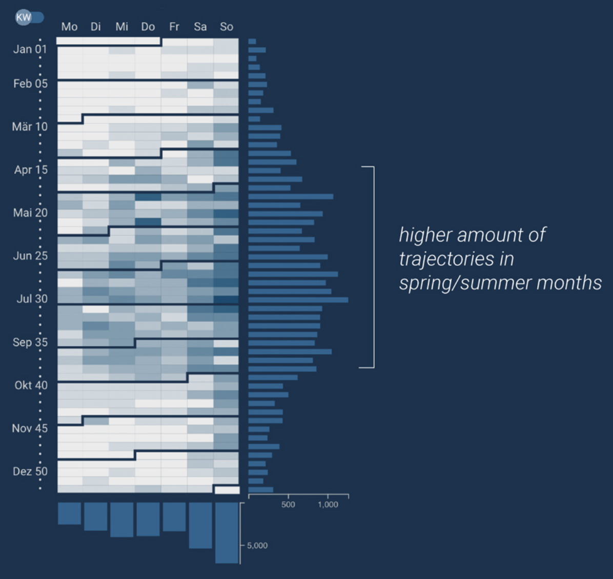
A vertical calendar heatmap, with added histograms for week totals to reveal seasonal patterns (on the right), and patterns related to the day of the week (at the bottom). Source: infovis-mannheim.de/viavelox
Calendar heatmaps can also be used to show time series at different time scales. The example below shows a heatmap for hourly data.
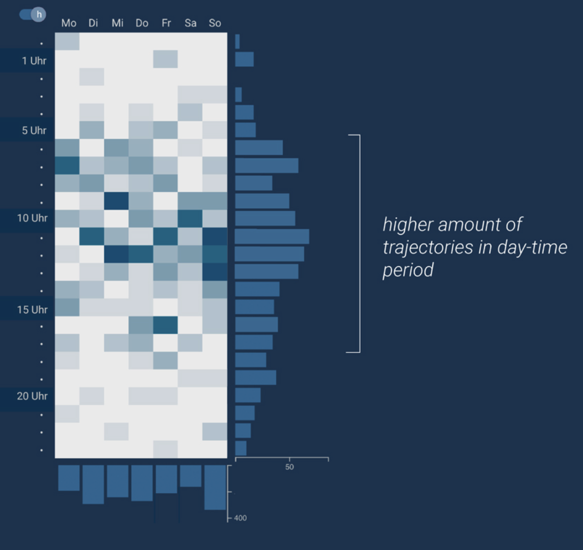
Source: infovis-mannheim.de/viavelox