Spotting long term trends in time series with a seasonal pattern is not so easy: the seasonal pattern makes it hard to spot the long term trends. For example, it is hard to conclude something meaningful about the long term trend in monthly Arctic sea ice extent data from the line chart below.
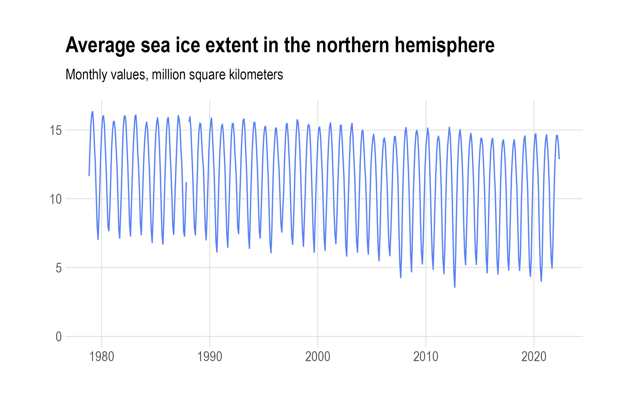
Source: Maarten Lambrechts, CC BY SA 4.0
Cycle plots solve this issue by isolating the seasonal patterns from the data. For the Arctic sea ice data, they do this by grouping the data values by month, and then plotting a little line chart showing the values for each month over the years.
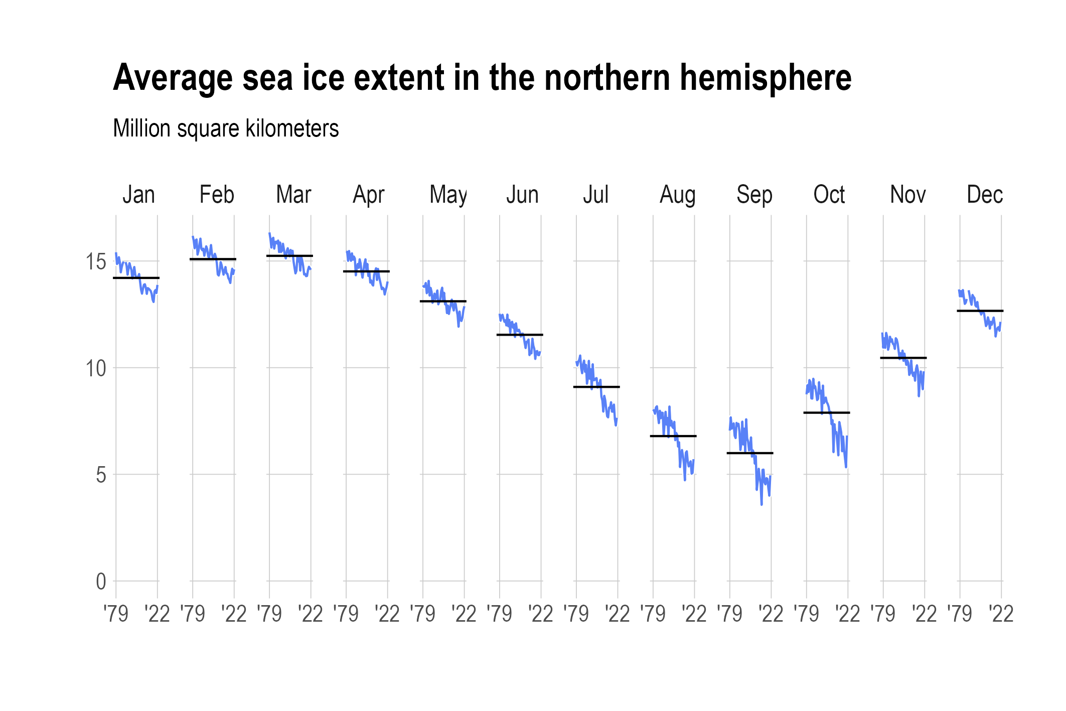
The horizontal lines show the average for each month over the full time range of the data. Source: Maarten Lambrechts, CC BY SA 4.0
With this plot, a lot of things become clear:
- there is a seasonal pattern, with a minimum in September and a maximum in March
- the general trend is downward for all months
- there are some fluctuations between years
- the downward trend is much stronger in the months the sea ice is at its lowest (August to October)
All these things were much harder to spot in the traditional line chart.
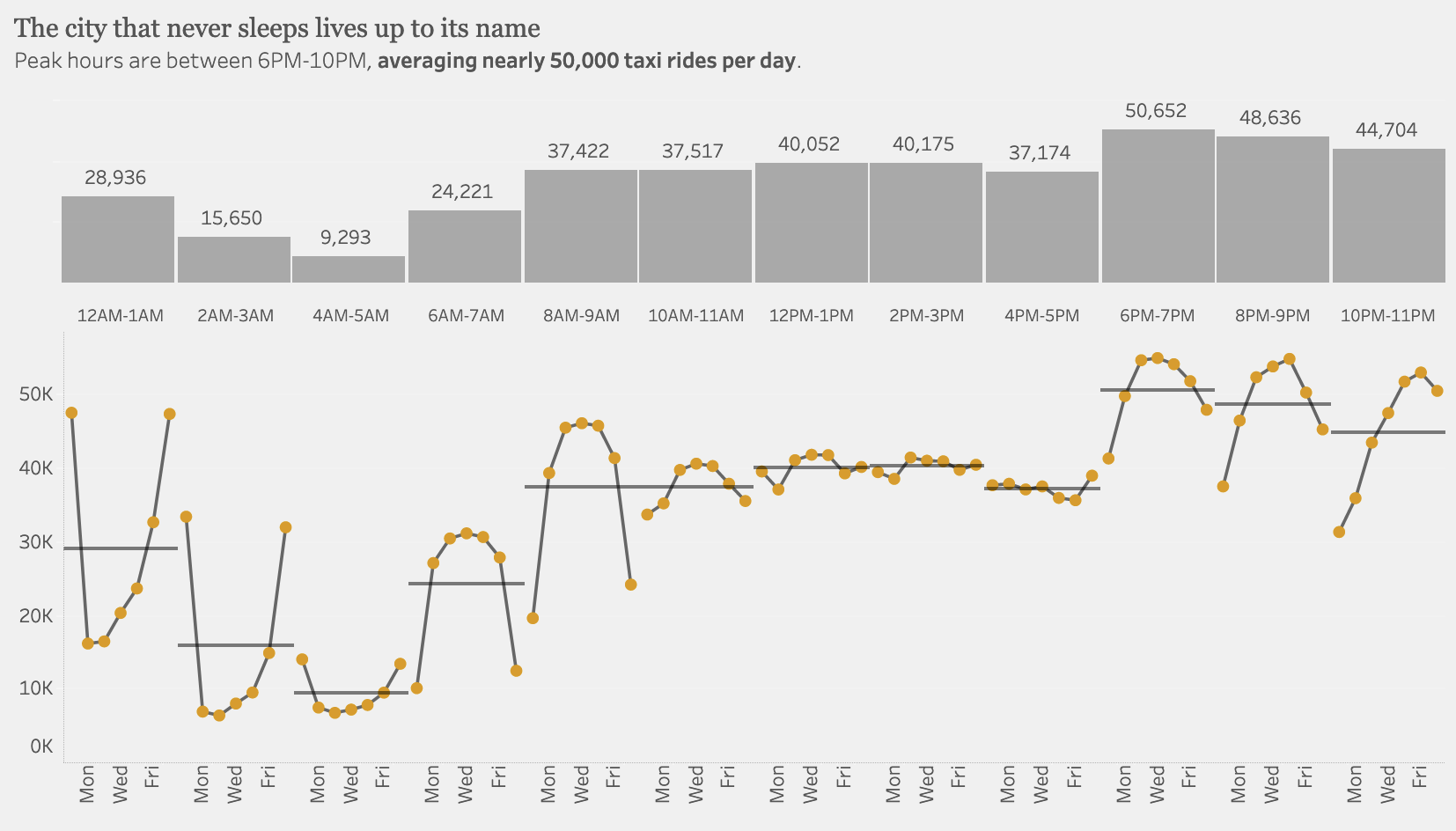
Below is a cycle plot of the number of taxi rides in New York by hour of day and day of the week. Can you explain the reverse pattern for the 12AM-1AM hour versus the 8AM-9AM hour? (Sunday is the first day of the week in this example)