Home icon
Data Visualisation Guide

Responsiveness: changing data density

2 minutes read

Responsive data visualisation

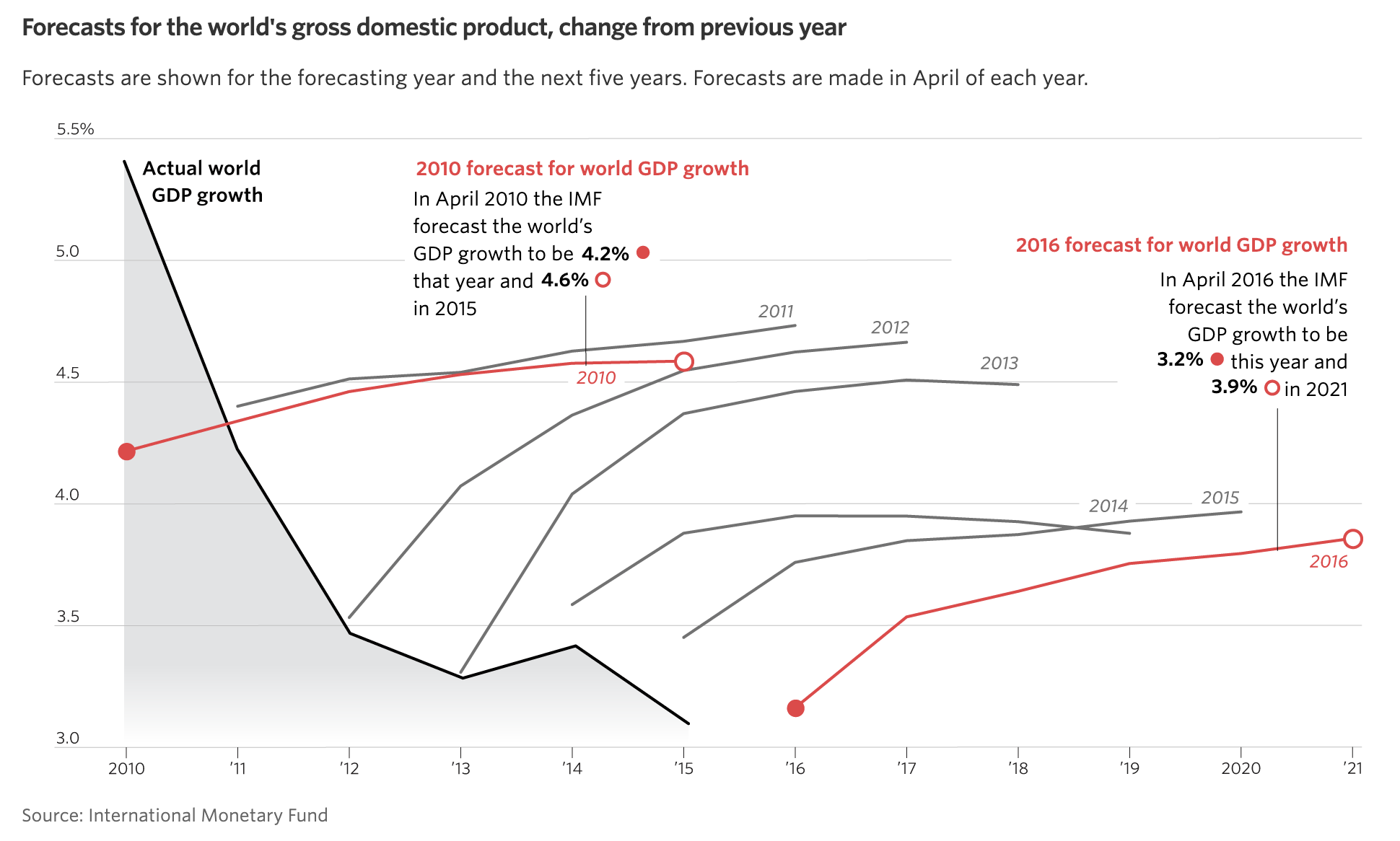
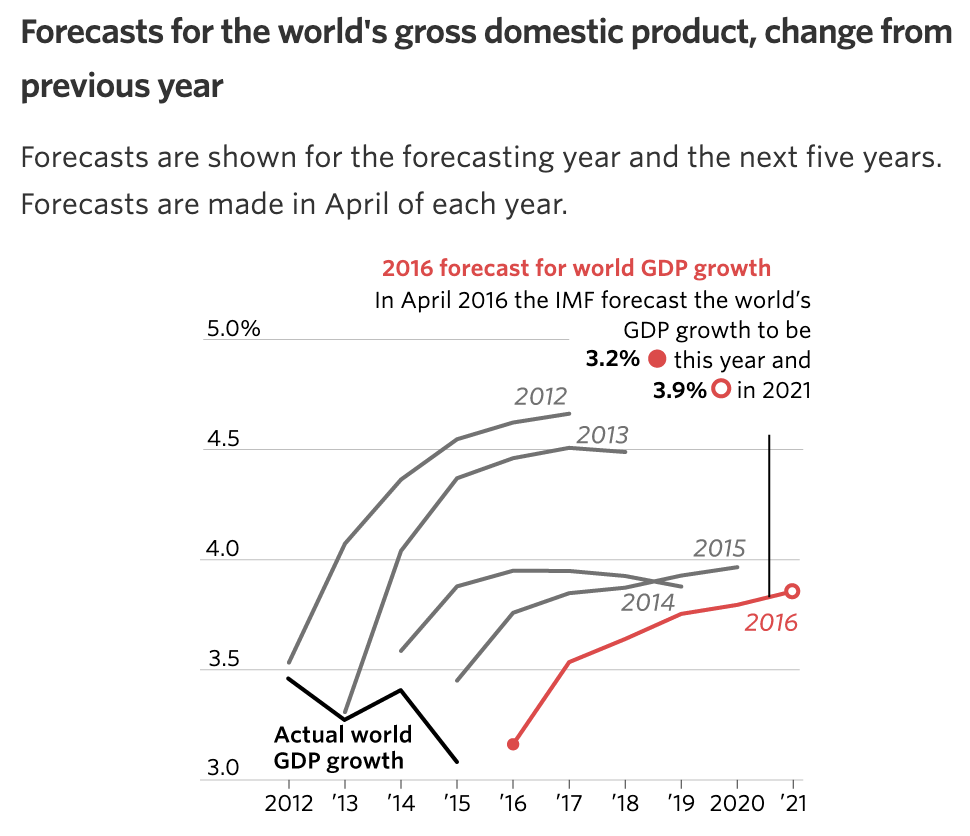
Simplifying a visualisation can also be done by leaving out data points through filtering or sampling. In the example below, the 2010 forecast for world GDP growth is left out of the visualisation on smaller screens.

A lien chart showing forecasts for world GDP, with a title Forecasts for the world's gross domestic product, change from previous years. The chart has two annotations for the forecasts in 2010 and 2016

Source: wsj.com

The same chart as above, but designed for small screens. Some of the forecasts are removed from the chart, and there is only one annotation

Source: wsj.com

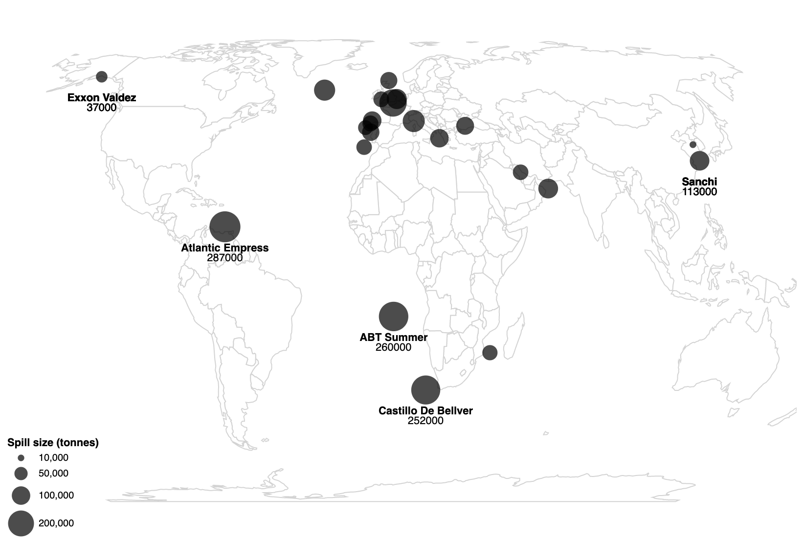
The map below shows the 20 biggest oil spills in 2018, with the size of the dots scaled to the size of the spill, and the most relevant ones labelled.

A world map with bubbles showing the biggest oil spills in the world in 2018, with 4 of the spills labelled

Source: Techniques for Flexible Responsive Visualization Design, Hoffswell et al

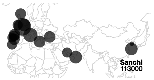
For a thumbnail version of this map, some smaller oil spills can be filtered out. In this way, the map can be zoomed in, and exclude parts of the world that are less relevant for the story the map is trying to convey. Notice that the number of labels is also reduced, and the bubble size legend is removed.

A thumbnail version of the map above, zoomed in on northern Africa, Europe and Asia. Only one oil spill is labelled

Source: Techniques for Flexible Responsive Visualization Design, Hoffswell et al

Related pages

Responsiveness: adapting annotations, axes and legends

Responsive text annotations

Choosing charts: the medium

Scaling charts

Responsive data visualisation: introduction

Responsiveness: scaling visualisations

Responsive data visualisation