It can be a big challenge to make bigger, more complex and interactive visualisations work on small screens, even when considering all the above strategies. Instead of scaling the visualisation down and reduce the number of interactive controls, zoomed in parts of the visualisation in a certain state (with data highlighted or filtered) can be annotated to explain key parts of the bigger visualisation. The full visualisation can be removed, or can be shown with a mini map (a mini map is a small copy of the full visualisation, highlighting the part that is currently zoomed in on).
An example of this technique is used in The Evolution of Trade Agreements. It shows the web of trade agreements between countries in a radial chart with additional controls and smaller visualisations to the side.
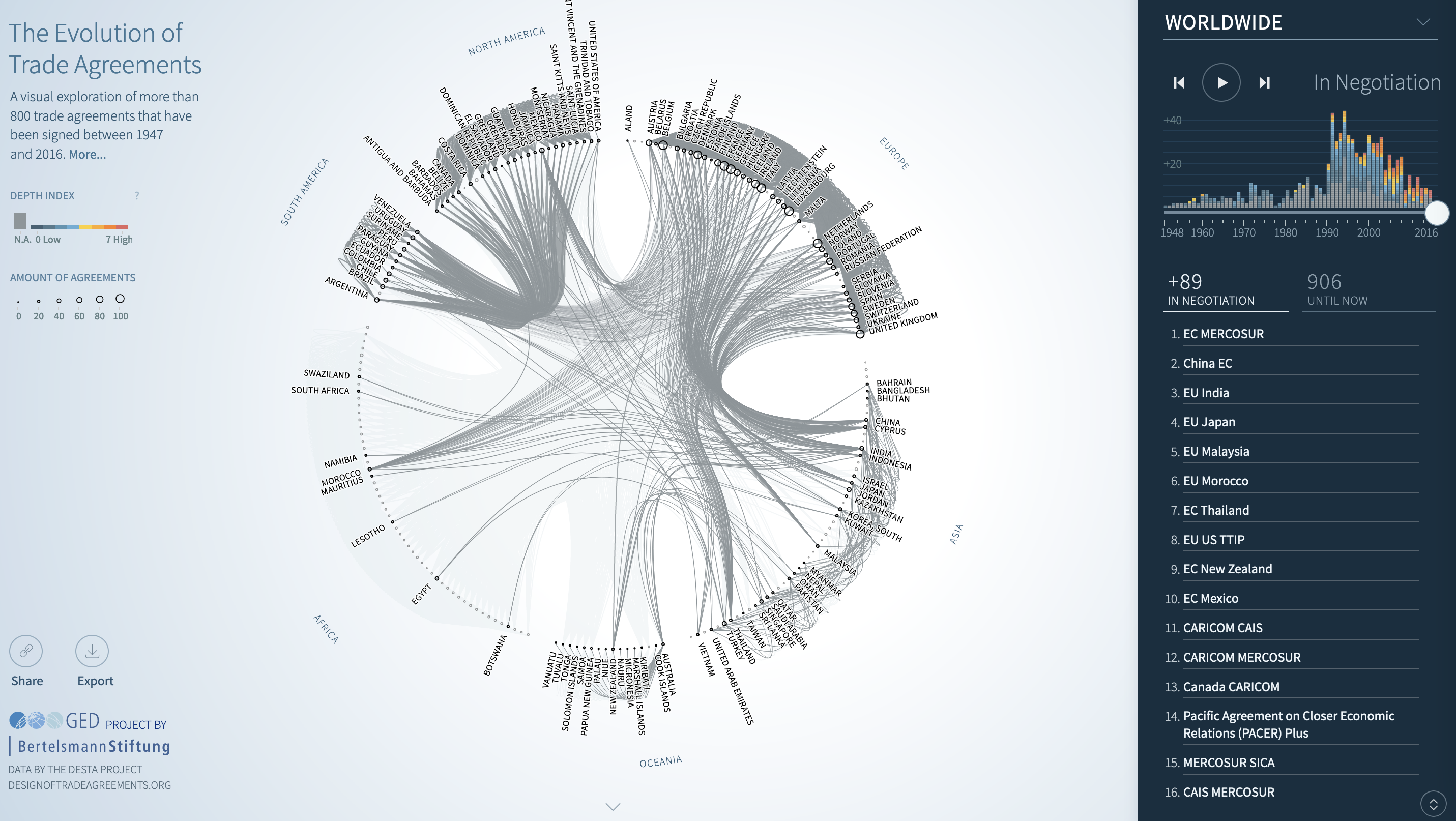
Source: ftavis.com
The visualisation and the interactive controls are not suitable for smaller screens, and are not displayed on these screens. Instead, screenshots of parts of the visualisation are provided, accompanied by a little explanation, in a section called “Selection of findings and data stories”.
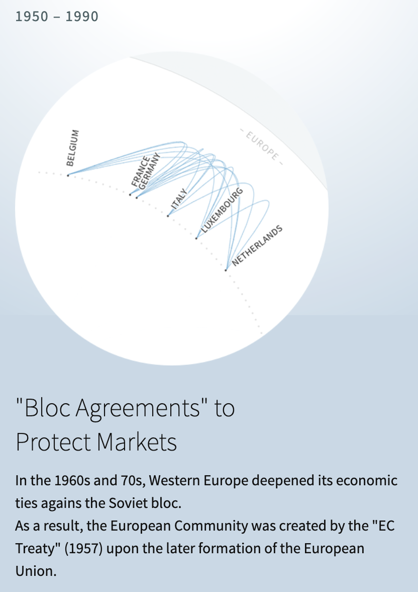
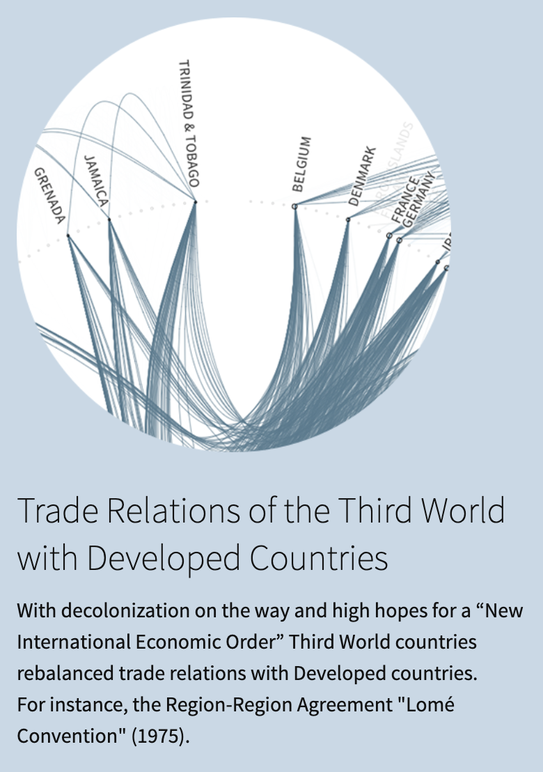
Source: ftavis.com
Reuters used a mini map to better show a world map on mobile screens.
Source: Creating responsive data visualisations, Gurman Bhatia