When space is limited, and visualisations or small multiples cannot be presented next or on top of each other in one view, the visualisations can be “stacked in time” by showing them in sequence over time. A popular file format for short animations of data visualisations is the GIF file.
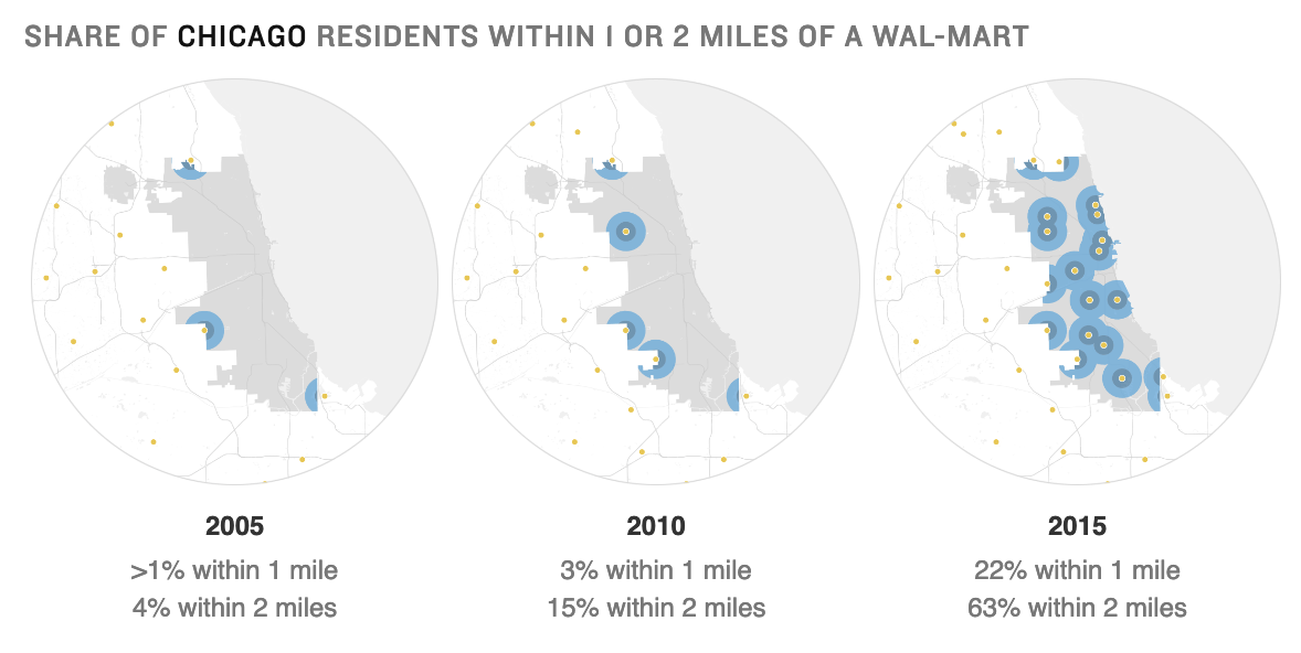
On wider screens, this small series of maps are presented next to each other. Source: npr.org
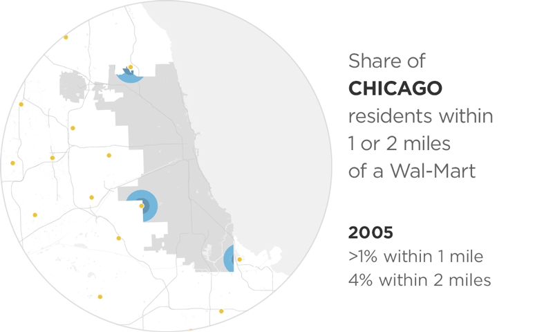
On smaller screens, the user is shown a looping gif animation. Source: npr.org
The reverse strategy is sometimes also used: showing an animated version of a chart on bigger screens, and a static one on smaller ones. In those cases, the static chart for smaller screens is usually a fallback, because making the animation work properly would involve much development work.
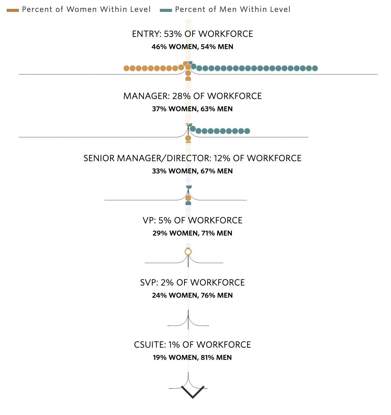
This visualisation showing the share of men and women at different levels in the workforce is animated on scroll on large screens. Source: wsj.com
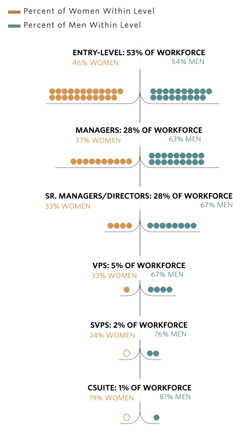
On smaller screens, the animated chart is replaced with a static version. Source: wsj.com