The way elements are arranged in a visualisation can determine its aspect ratio. And when the layout is made “fluid”, you can ensure that the visualisation is presented in an optimal way on all screen sizes.
The following icons show the number of deaths in a mass shooting in Las Vegas in 2017. On desktop, the icons are spread over 2 rows.
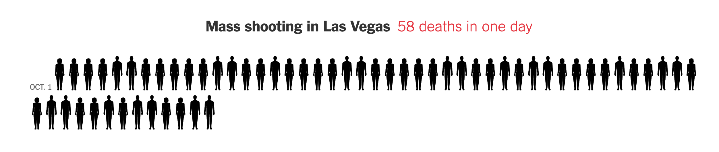
Source: nytimes.com
On smaller screens, the icons are not scaled, but they are distributed over more rows.
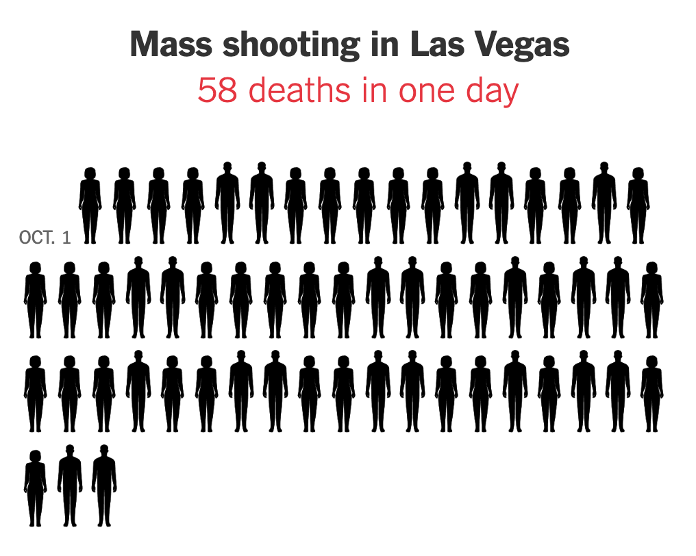
Source: nytimes.com
The same fluid layout can be applied to small multiple visualisations (small multiple visualisations are small copies of the same chart showing data for different categories).
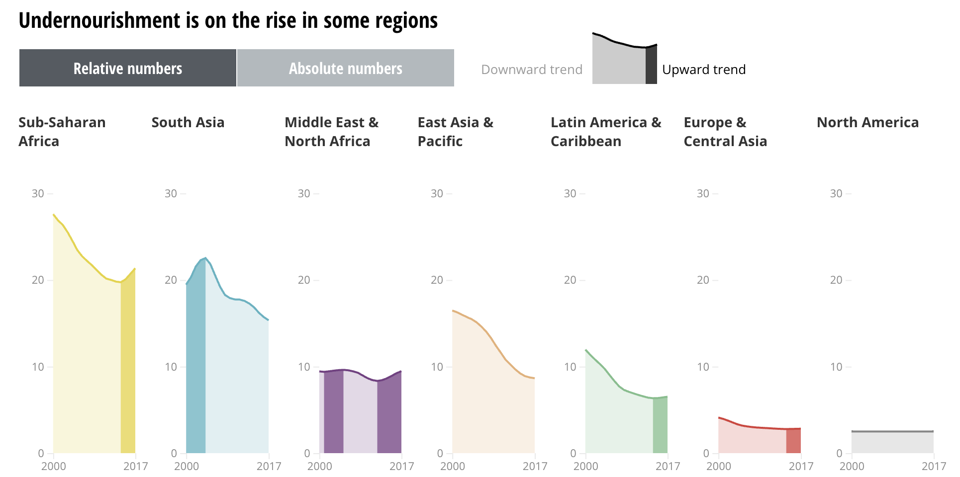
Small multiple charts are arranged next to each other on screens that are wide enough. Source: Sustainable Development Goals Atlas 2020, The World Bank
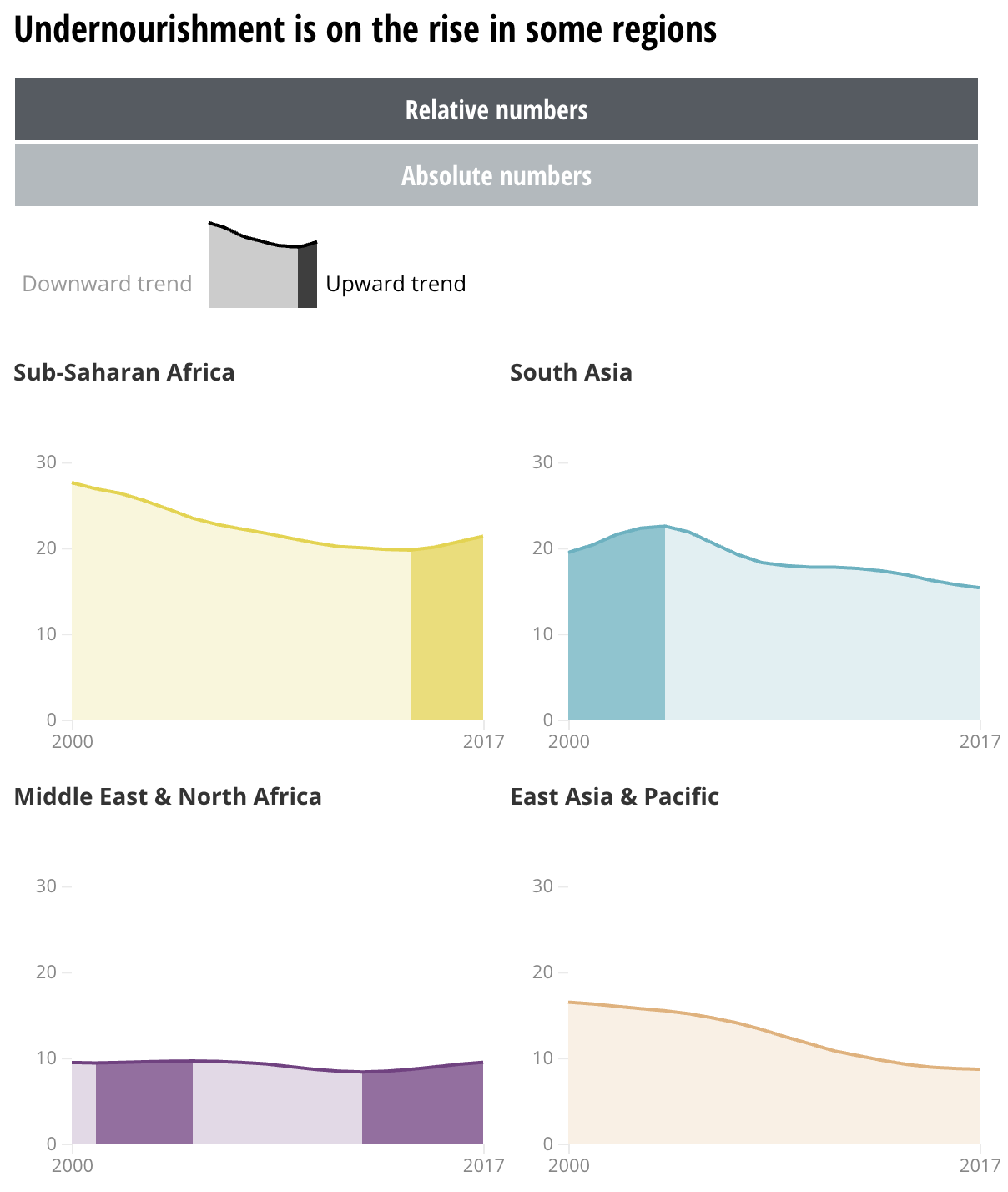
On smaller screens, the small multiples are arranged over multiple rows. Source: Sustainable Development Goals Atlas 2020, The World Bank
Notice that spreading the small multiples over multiple rows most likely will cause the visualisations not to be visible all at once. To compare the charts, users will have to scroll up and down.
Also notice that the elements surrounding the visualisations (the buttons for switching between relative and absolute numbers, and the legend that explains the downward and upward trends) are also fluidly positioned. On big screens they are positioned next to each other, while on mobile they are placed on top of each other. This is a technique commonly used in visualisations with a lot of user interaction controls and in dashboards.
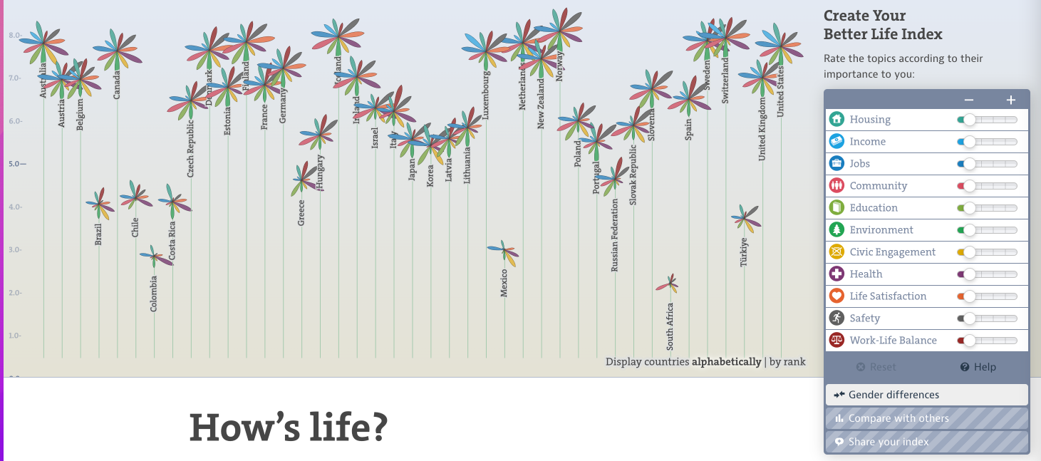
The controls in the OECD Better Life Index are positioned on the side of the visualisations… Source: www.oecdbetterlifeindex.org
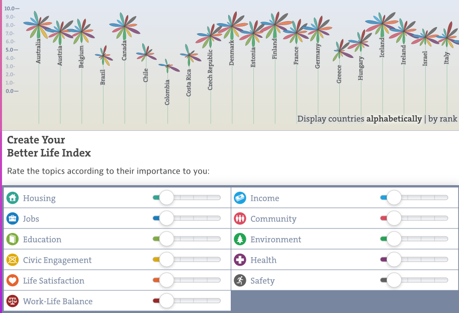
… while they are positioned below the visualisations on smaller screens. Source: www.oecdbetterlifeindex.org
Besides adopting a fluid layout of chart and user interface elements, the design of a visualisation can also be adapted to create a high layout from a wide one. One example of this is to integrate the category labels of a bar chart directly in the visualisation instead of positioning them next to bars.
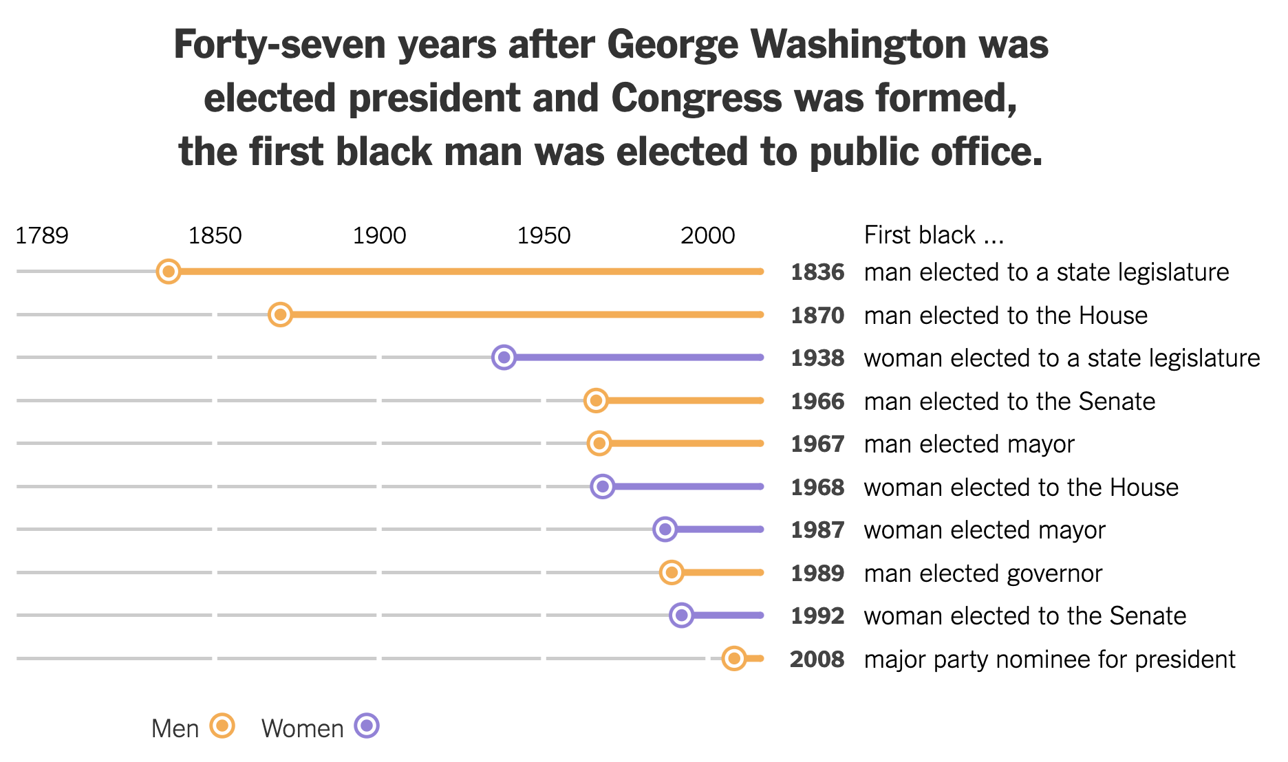
A layout for wide screens, with the labels to the right of the visualisation… Source: nytimes.com
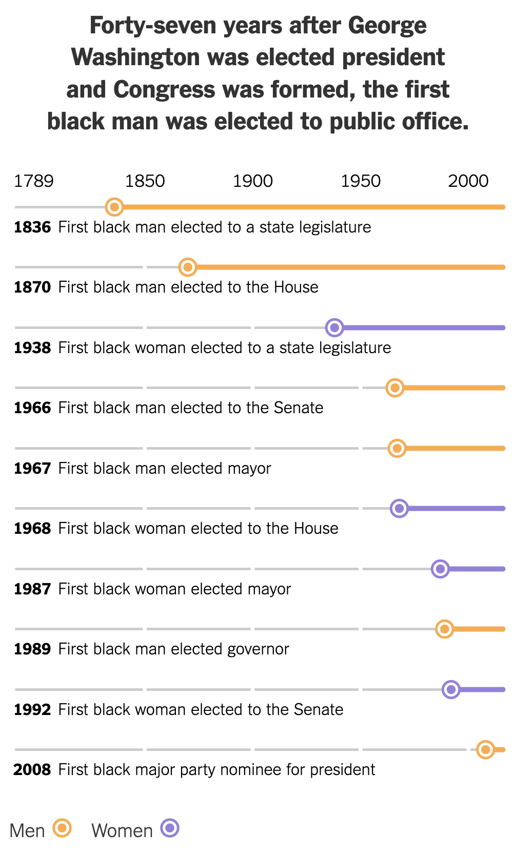
…and a high layout for tall screens, with the labels integrated. Source: nytimes.com