When a visualisation is assigned a smaller space on screen or on paper, another technique to make it respond to that is to simplify and reduce the amount of detail in the visualisation. This can be done by aggregating the data to a higher order by calculating the mean or sum for groups of related data items. For example, a map showing data at the level of the EU regions on big screens could show only data at the national level on smaller screens.
Similarly, daily values can be aggregated to weekly averages, weekly to monthly averages and so on to reduce the number of visual elements to draw in a visualisation.
When data values are binned, like on a histogram for example, the bin sizes can be adjusted to show more or less bins depending on the available screen size. Both histograms below show the same data, but are using different bin sizes.
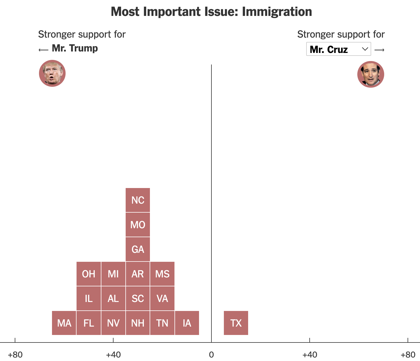
This chart shows the difference in voting support in different states among voters that say that immigration is the most important issue of the 2016 presidential elections in the US. It is using a bin size of 10 percentage points. Source: nytimes.com
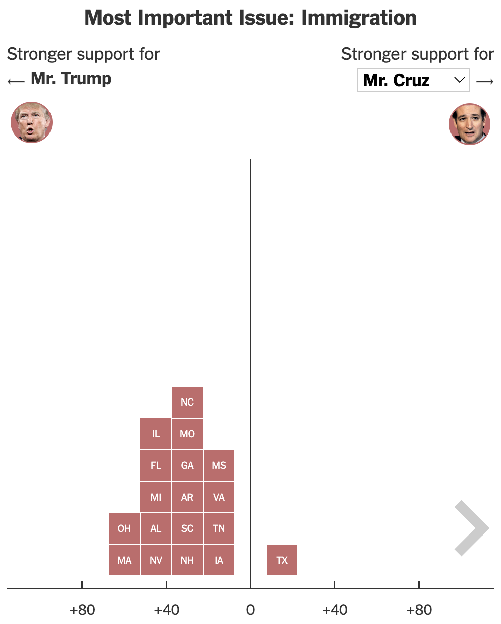
This version of the same chart uses a wider bin size for the histogram, resulting in in less (but higher) columns. Source: nytimes.com