After just removing a visualisation, the most radical way to adapt a visualisation for smaller screens is to change its visual encoding, and using another chart type.
In order to show time series with annotations on smaller screens, NPR changed the chart type from a line chart to a heatmap in the following example.
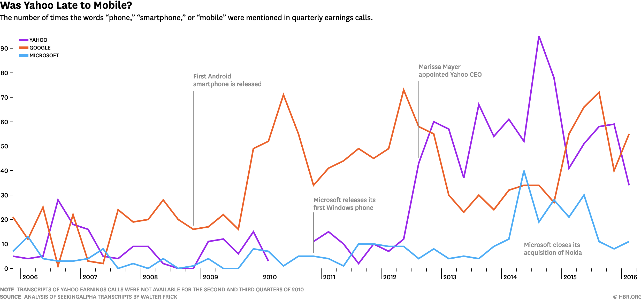
Source: hbr.org
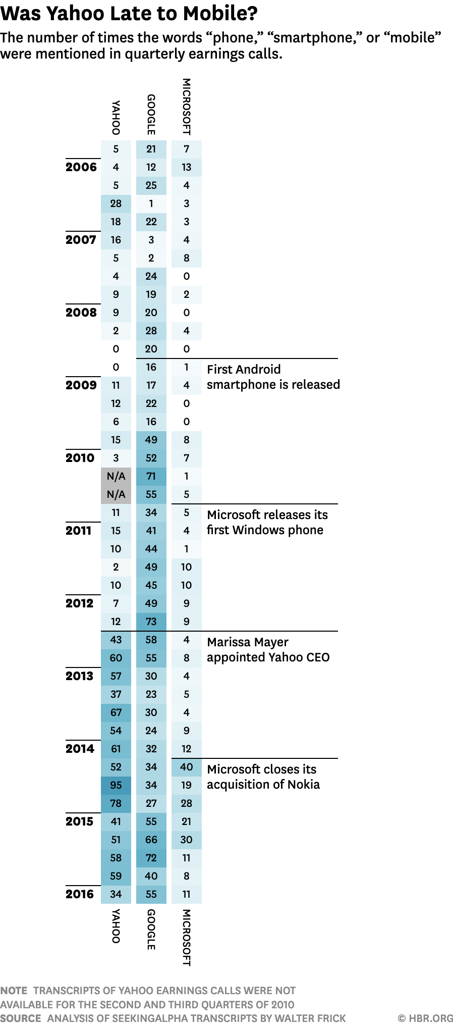
Source: hbr.org
From an accessibility standpoint, showing a table with the data contained in a visualisation is a good idea. It can also be a good fallback on mobile screens, as demonstrated by this map by the New York Times:
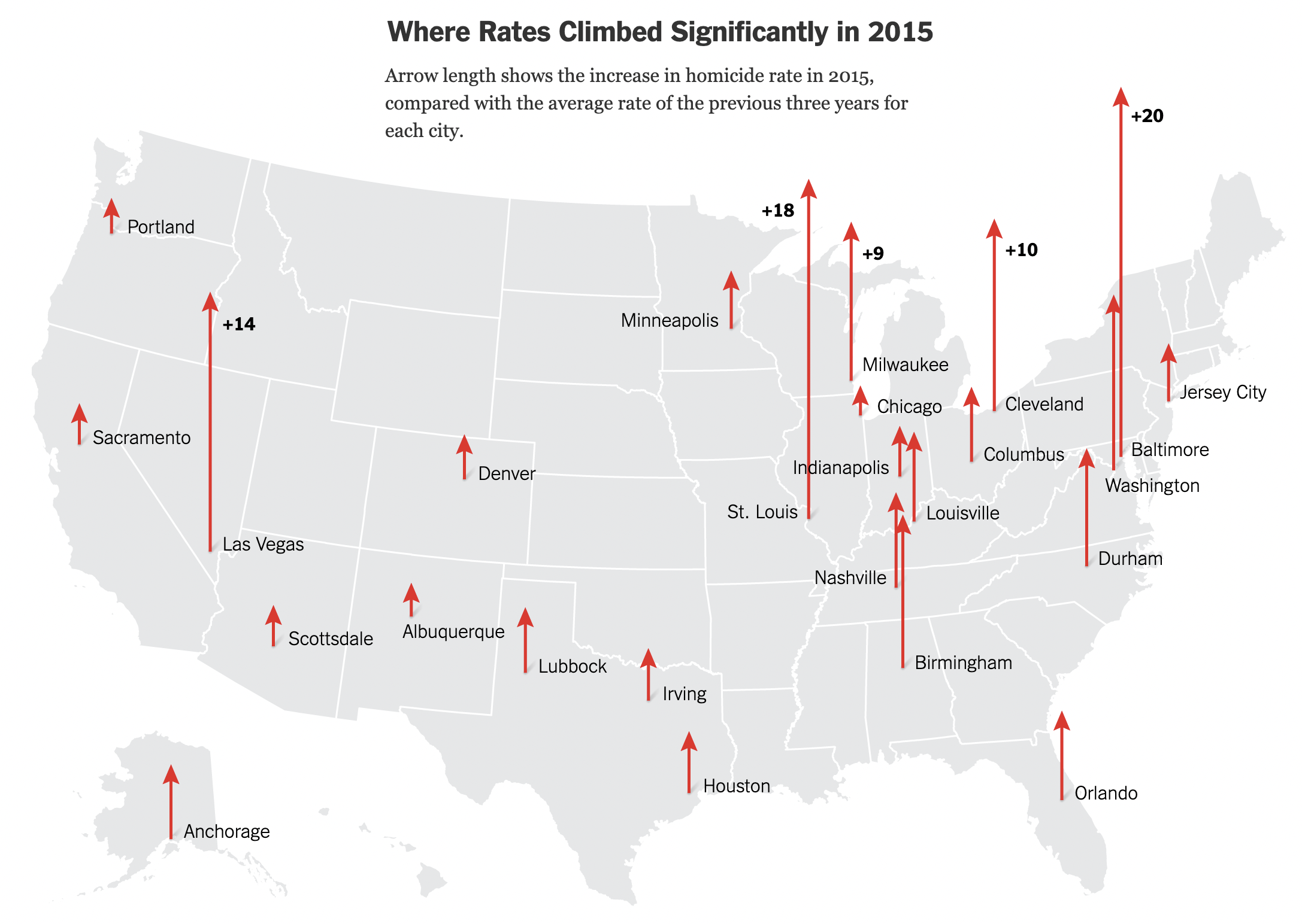
Source: nytimes.com

Source: nytimes.com